What Makes Swiss Design So Effortlessly Cool?
Clean, crisp, and allergic to clutter—Swiss design is what happens when your fonts have their life together.
Every maximalist’s worst nightmare? Swiss graphic design.
I can already hear some of you groaning. “Minimalism is ruining the world!” you say, picturing yet another all-white website or Helvetica-heavy poster. But before you scroll away, let’s pause. Because this isn’t just about stripping things down. Swiss design—also known as the International Typographic Style—is one of the most elegant, practical, and strangely addictive design movements in history. And it didn’t come from a Pinterest board. It came from a deep desire to make design work—clearly, beautifully, and with intent.
It all started in Switzerland in the late 1940s and ’50s, when designers like Joseph Müller-Brockmann and Max Bill decided they’d had enough of the overly decorative chaos that came before. They were tired of fluff. They wanted design to do its job: communicate. And they wanted it to look good doing it. This was a time when the Bauhaus movement had already planted the seeds of modernism — all those clean lines, functional objects, and geometric forms. Swiss designers just took those ideas and ran with them, turning them into a fully formed language of design.
And here’s the part I love — beauty was never optional in their world. Just because something was minimal didn’t mean it had to be boring. The elegance came from the restraint.
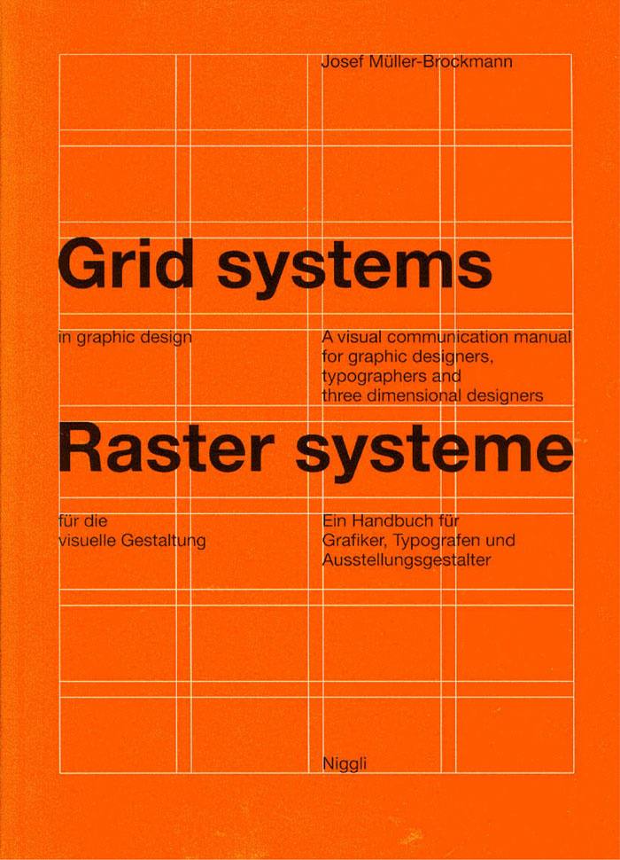
What makes Swiss design so unique isn’t just what you see, but how it works behind the scenes. It’s built on grids — invisible frameworks of vertical and horizontal lines that quietly bring order to the chaos. These grids are like the uncredited heroes of graphic design. They make sure that everything aligns, nothing feels random, and your eyes always know where to go. Müller-Brockmann was so obsessed with grids he wrote entire books about them (which, side note, look fantastic on a coffee table whether or not you read them).

Then comes the typography. If Swiss design had a soundtrack, it would be Helvetica. Born in 1957 in — where else — Switzerland, it became the face of modernity and clarity. And yes, maybe you’re tired of seeing Helvetica everywhere. But there’s a reason it’s everywhere. It works. It’s clean, neutral, and readable at any size. In Swiss design, type isn’t just decoration — it’s the star of the show. Sans serif fonts like Neue Haas Grotesk or Inter Variable also carry that legacy forward. They say a lot by doing very little.
Now here’s where it gets clever. Swiss design doesn’t just centre everything and call it a day. Instead, it plays with asymmetry. It knows that imperfection, when done intentionally, creates tension and movement. Using those precise grids, designers balance layouts in unexpected ways that feel dynamic without ever feeling messy. It’s that “perfectly off” look — a tilted block of text, a floating image, a stretch of white space — that keeps your eyes moving without overwhelming your brain.
Speaking of white space, Swiss design loves it. You won’t find busy patterns or filler graphics. Images are used sparingly — often in black and white or high contrast — and only when they add value. Same with illustrations: they’re geometric, simple, and never showy. This is a world where every element has to earn its place.
Color palettes? Minimal, of course. Usually just black, white, and maybe a bold third color for emphasis. That’s where something like the 60-30-10 rule comes in — a smart way to balance three colours without making the design feel chaotic. If you’ve seen the show Severance, you’ve probably seen this in action, whether you realised it or not.
But here’s the kicker: Swiss design isn’t just a relic of the past. It’s everywhere. Corporate branding leans on it to look professional and trustworthy. Editorial design uses its structure to make dense information easier to digest. Airports, hospitals, and train stations all rely on its clean layouts and legible typography to communicate at a glance. When time and clarity matter, Swiss design delivers. Even on the web, its principles shine. Grid systems make responsive layouts easier to build. Minimalism improves loading times. And clean typefaces? They’re easier to read on a screen, especially when you’re juggling ten tabs and bad lighting.
So why does this style keep surviving wave after wave of design trends?
Because it works. It’s not trying to be trendy — and that’s exactly why it’s timeless. It’s built on function, not flash. It gives designers a framework that actually makes their ideas clearer, not duller. You don’t lose your creativity inside a grid — you just learn to use it better. Think of it like budgeting. To some, having strict limits sounds suffocating. But to others, it’s the very thing that gives them peace and freedom. You know where your money is going, and you know when to splurge — and that gives you confidence. Swiss design does the same thing for creativity. It proves that rules aren’t the enemy. They’re the path to better, more intentional work.
And yes, I get it. Some people see minimalism as lifeless — design stripped of soul. But that misses the point. Swiss graphic design isn’t soulless. It’s quiet confidence. It’s clarity over noise. It’s giving the viewer a gift: the ability to see, read, and understand something without friction.
So next time you see a layout that feels effortless, or a poster that communicates everything in a glance, or a website that just makes sense — take a second look. It might just be Swiss.


this is the nicher art stuff I wanna see, very fun read!!